A desktop app needs more than larger versions of its phone controls. Dialogs need their own windows. Title bars, scrollbars, and keyboard focus need to behave as desktop users expect.
Last week we introduced the native desktop theme experiment. This week we bring those themes into production use. Fluent, Aqua, and Adwaita include refined controls in light and dark appearances, plus the window and dialog defaults that go with them. Your application can inherit those styles and retain its own branding.
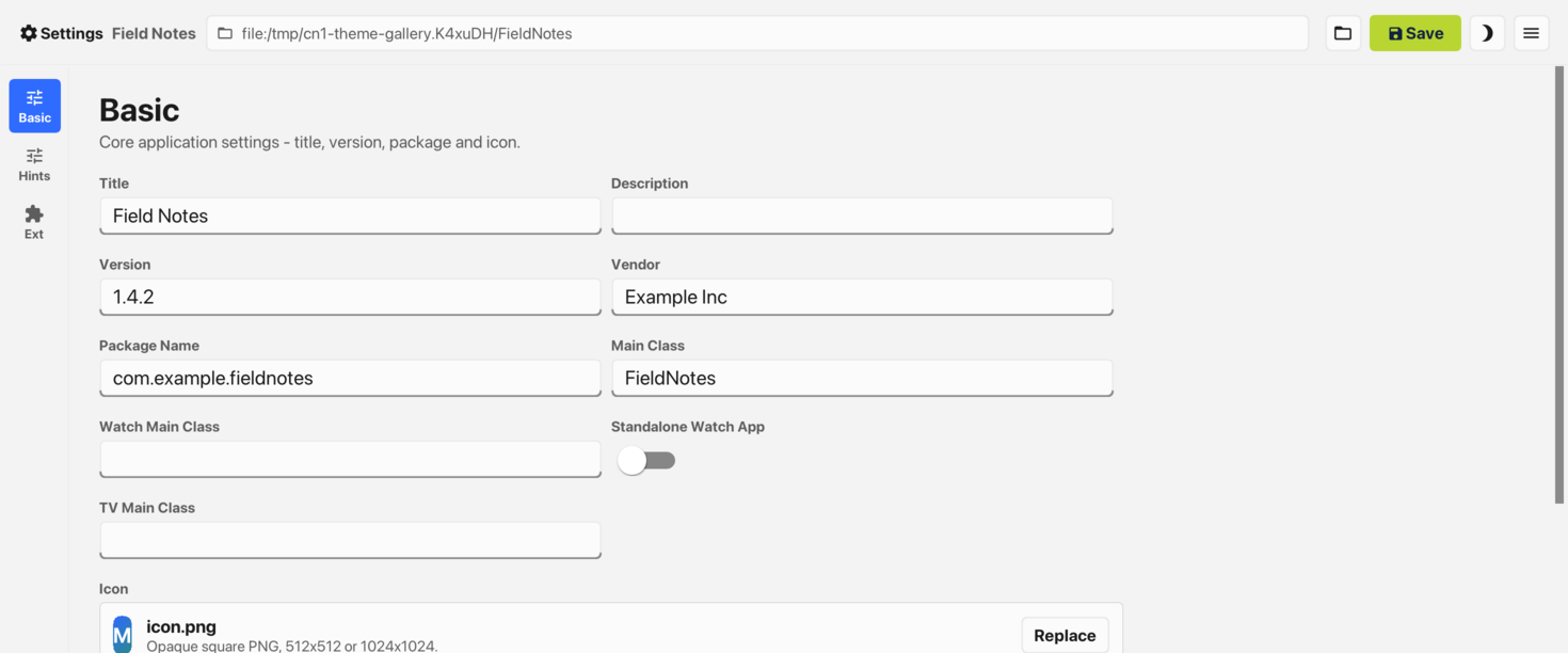
The Codename One Settings tool now uses them too. Its main class selects @DesktopBuild(themeMode = "native"), choosing Fluent on Windows, Aqua on macOS, and Adwaita on Linux. Working through its forms and dialogs gave us concrete problems to fix in the themes. The screenshots below show the result, followed by the settings and CSS you can use in your own app.
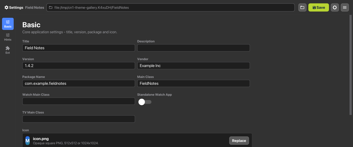
See the same application in each theme
These are repository captures of the real Settings application. All six were made on a Mac. They show theme colors, borders, spacing, and light/dark styling. Fluent and Adwaita fall back to the Mac’s font in these captures; they are not screenshots of the application running on Windows or Linux. The respective platform fonts change the text on those hosts.
Fluent
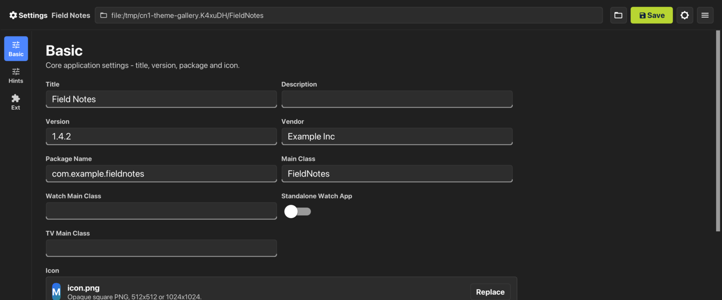
Aqua
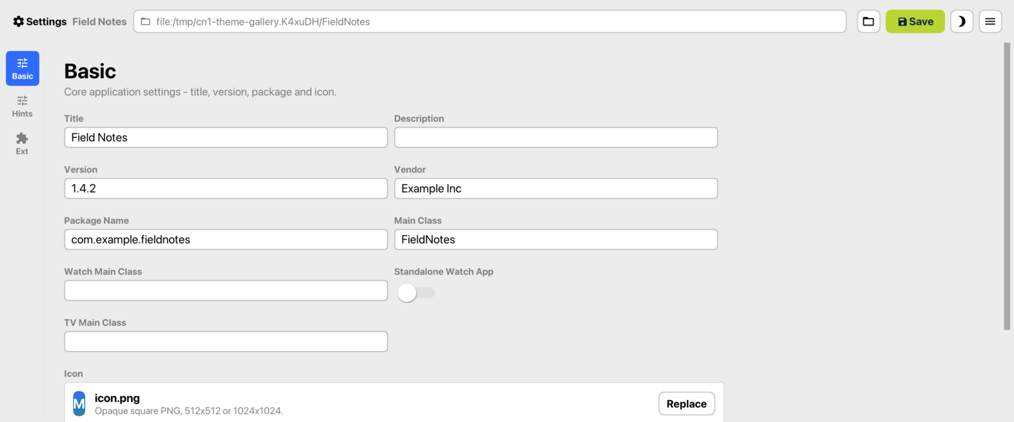
Adwaita
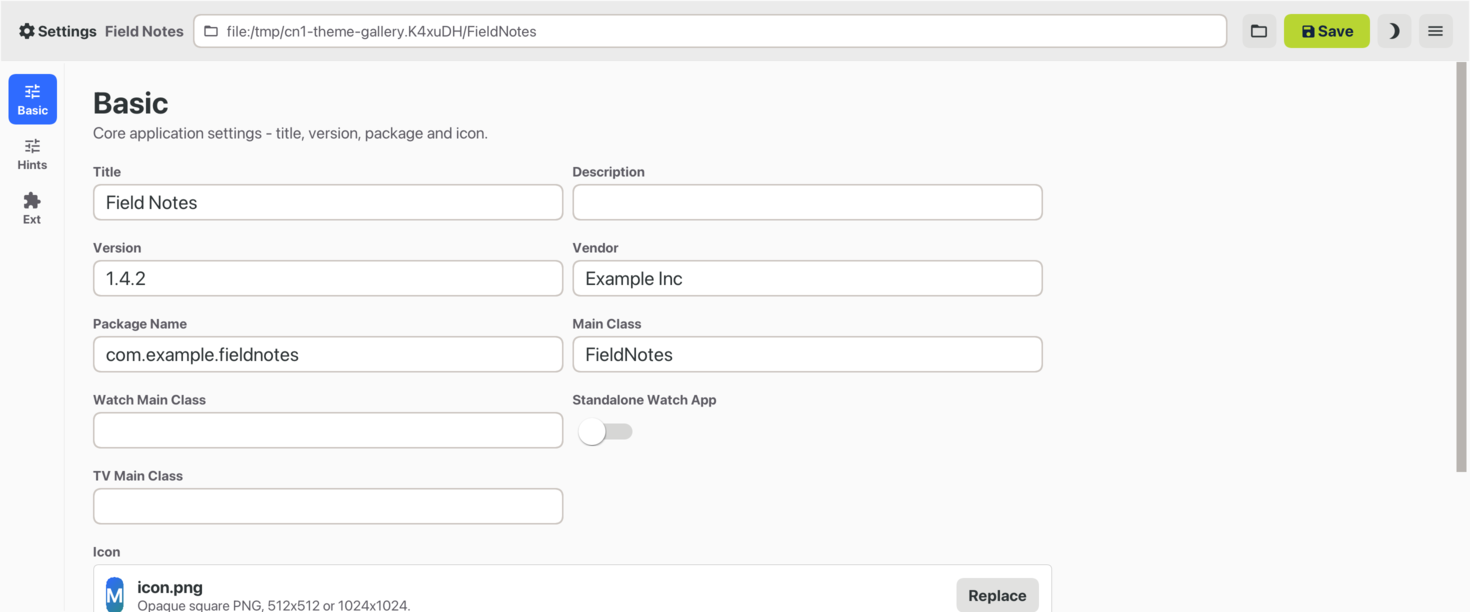
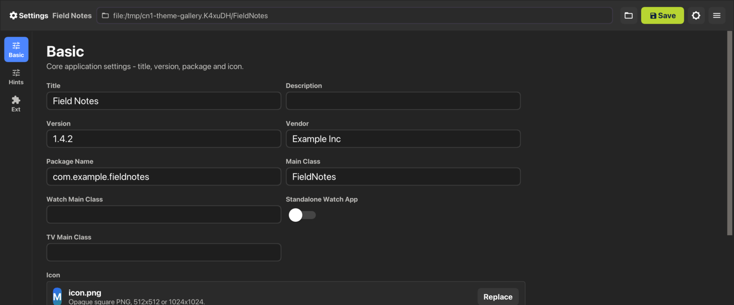
The captures come from the native-theme guide. Their value is the complete screen: the theme has to make the relationships among controls readable, rather than make one isolated button resemble a reference tile.
Opt in without repainting every control
For a JavaSE desktop build, set this in the Settings app under Build Hints:
desktop.themeMode=native
native and auto select the host’s theme. An explicit fluent, aqua, or adwaita selects that family even on another host. Unset remains legacy, preserving existing applications. On the separate native macOS port, Aqua is already the default when neither macos.themeMode nor the shared nativeTheme hint is set. You can select it explicitly with:
macos.themeMode=native
An explicit shared theme setting still applies: for example, nativeTheme=modern selects the iOS-style modern theme on this port. JavaSE desktop and native macOS are separate ports with different defaults.
In the simulator, select the Desktop skin, then choose a theme from Native Theme. With Auto, the Desktop skin follows desktop.themeMode, matching the packaged application’s choice.
Inherit the role and override the brand
A custom UIID should begin with the native UIID whose behavior it refines. For example, in your application’s theme.css:
/* Compiler fallbacks. Native theme palette values replace these at runtime. */
Container {
    --text-secondary-color: #5D5D5D;
    --text-secondary-color-dark: #CFCFCF;
}

ProjectNameField {
    cn1-derive: TextField;
}

ProjectPrimaryAction {
    cn1-derive: RaisedButton;
}

ProjectCard {
    cn1-derive: GroupBox;
}

ProjectHelp {
    cn1-derive: Label;
    color: var(--text-secondary-color);
}

@media (prefers-color-scheme: dark) {
    ProjectHelp {
        color: var(--text-secondary-color-dark);
    }
}

#Constants {
    includeNativeBool: true;
    --accent-color: #00796B;
    --accent-color-dark: #4DB6AC;
    --accent-fg-color: #FFFFFF;
    --accent-fg-color-dark: #102522;
    --accent-pressed-color: #00695C;
    --accent-pressed-color-dark: #26A69A;
    --selection-color: #00796B;
    --selection-color-dark: #4DB6AC;
}
The Container declarations give the CSS compiler concrete values for var(). Keep these palette fallbacks outside #Constants: the compiler records their bindings, and the installed native theme supplies the runtime colors. Exporting the fallbacks as constants would override the platform palette.
The brand colors belong in #Constants because they should override the native palette. Both appearances need their own values, including the pressed and selection colors. The field and card inherit the platform’s control treatments; ProjectHelp binds to its secondary text color in each appearance.
Assign the UIID in Java as usual:
TextField projectName = new TextField();
projectName.setUIID("ProjectNameField");

Button create = new Button("Create project");
create.setUIID("ProjectPrimaryAction");
This doesn’t turn every component into an OS widget. Codename One still draws the controls. Theme inheritance lets the same application rules use each platform’s styles without copying its palette into the application.
A dialog should be a window when the desktop expects one
The native desktop themes set defaultNativeWindowModeBool to true. An ordinary Dialog opens in a real operating-system window instead of appearing only as an overlay inside the application form. Its content remains CN1-rendered. Anchored popups such as combo boxes and context menus retain their popup behavior.
That distinction affects focus, ownership, placement, and keyboard handling. It is also why “native dialog” needs a precise meaning here: a native window contains the CN1 dialog; we aren’t claiming every dialog becomes an OS alert with OS-drawn controls.
Packaged JavaSE apps use native title bars by default with all three themes. The wrapper generator writes desktop.titleBar=native when the build hint is unset, and that property takes precedence over the theme constant. Set desktop.titleBar=custom explicitly if you want custom desktop chrome.
The simulator can expose a different default: without a title-bar property, it falls back to desktopTitleBarMode from the theme. That constant is native in Fluent and Aqua, and custom in Adwaita. An Adwaita simulator capture therefore doesn’t establish the title bar a packaged app will use. The wrapper generator controls that packaging behavior.
Mouse behavior belongs in the theme too
A desktop scrollbar needs a thumb you can grab, a track you can click, and space that doesn’t disappear while you’re aiming at it. The desktop themes enable interactive scrollbars with that behavior.
Hover is another platform decision. Fluent and Adwaita have their own pointer states. Aqua keeps ordinary button and field hover equal to normal because the AppKit reference does. Adding a highlight everywhere would make the theme less faithful, even if it looked more responsive in a demo.
JavaSE reads the desktop’s light/dark appearance at launch. The simulator has its own appearance menu. Don’t assume these captures establish live theme switching on every packaged desktop platform.
Try a form with awkward content
PR #5886 connects the Settings application and simulator to the themes and records the six captures. The theme sources and behavior notes show the UIIDs and constants the application inherits.
For your first screen, choose one with a long label, a validation error, and a dialog. Check keyboard navigation, resizing, and dark appearance. A compact component gallery can hide the spacing and window-ownership problems that an ordinary application exposes immediately.
This closes the weekly series. The same choice runs through the iOS and desktop work: use the platform conventions deliberately, keep the application styling under your control, and test the result in a screen people actually need to use.
Discussion
Which desktop convention is easiest to overlook when an application starts on a phone: keyboard focus, window ownership, or the behavior of scrolling?